soj.ooO
BETA
The social discussion platform
Home
Pochas
Channels
Videos
Log in
Sign up
Sign up
Home
Pochas
Channels
Videos
Log in
Sign up
Parent Post: Welcome Joseon denizens~
·
In Reply To
podunamu
·
3/22/2025, 12:56:07 AM
·
permalink
I like this one, actually. Although the blue line should be under the symbols rather than over them. The "spikes" are actually fringes that are attached to the flag. They can be omitted since it will be cheaper to produce flags without them.
Save
Cancel
8
bumps
Share
L
logical
·
3/22/2025, 12:57:36 AM
·
permalink
Yes I agree i did not intend the blue line to cross over the center symbol, an unfortunate side affect of me not having photoshop anymore.
Save
Cancel
6
bumps
Share
podunamu
·
3/22/2025, 6:11:44 AM
·
permalink
a modified version of the flag appears on the whitepaper: https://joseon.cloud/JoseonWhitepaper.pdf 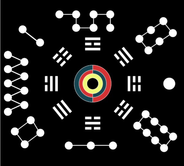
Save
Cancel
4
bumps
Share
L
logical
·
3/22/2025, 6:25:28 AM
·
permalink
we can make the most beautiful flag ever. I like this idea of the center circle being connected, inner harmony. The outer symbols seem somewhat chaotic though
Save
Cancel
2
bumps
Share
Signature
Loading…
Verify locally
Close